Use a command button for an action that will be performed instantly. Use more than one button when the user can choose from separate actions, such as OK and Cancel. Do not crowd a dialog box or panel with command buttons; consider reorganizing the contents of the panel or dialog box instead.
The default command button provides the safest choice for the user's data--the action that is most likely to preserve that data. The default button is always activated by the Return key as well as by clicking.
If there is more than one safe choice, the default should be the button that preserves the user's data and continues the current task. For example, in a spelling checker panel, an Ignore button preserves the spelling of the current word and continues to check spelling.
When you implement a command button, provide the label text, a graphic, or both. You must also determine whether the button is laid out from left to right, right to left, top to bottom, or bottom to top:
The CommonPoint application system determines the button's size based on the selected layout and the sizes of the label text and graphic. This preferred size is the default and will be used unless you override it by specifying a fixed size.
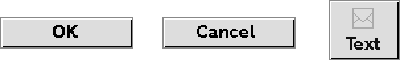
The button's label (text, graphics, or both) is centered vertically and horizontally within the button. For the label text, use a verb that describes the action the button performs. The text should be one or two words.
For picture buttons, you can specify the text and graphic sizes you want and they will be laid out correctly on the button. If you are using multiple picture buttons, make sure the pictures are all the same size so that each button is the same size, or specify a fixed size that is the size of the largest button.
Use picture buttons sparingly--too many picture buttons can add visual clutter to the interface. Picture buttons can be useful, however, when space is at a premium, such as on a ruler.
A combination text and picture button can show a state and describe an action--for example, an Update button can indicate whether a document has been updated and allow the user to update a document.
When the user mouses down to click on a command button, the button is highlighted and appears recessed, indicating the button has been pressed. The action initiated by the button is carried out after the mouse up.
When to use a command button
Default command button

Command button layout

Picture buttons
Command button interaction

[Contents]
[Previous]
[Next]
 Click the icon to mail questions or corrections about this material to Taligent personnel.
Generated with WebMaker