
Use radio buttons when the user can select one setting at a time from a group of two to seven items. To present more than seven mutually exclusive settings, use a pop-up menu or a scrolling list.
When you implement a group of radio buttons, supply a group label and a label for each button. The group label identifies the buttons as a whole. For both types of labels, use brief descriptive phrases--from one to three words.
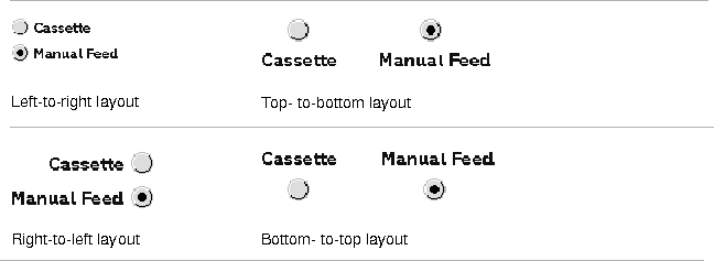
When you implement a radio button, you also determine whether the button is laid out from left to right, right to left, top to bottom, or bottom to top:
The CommonPoint application system automatically lays out the radio button group for you, placing each button label to the right of its button. However, you must place the group label above or to the left of the group.
When the user mouses down to click on a radio button, the radio button is highlighted. On the mouse up, a dot appears inside the button and remains there until the user clicks another radio button.
When to use radio buttons
Radio button layout
Radio button interaction

[Contents]
[Previous]
[Next]
 Click the icon to mail questions or corrections about this material to Taligent personnel.
Generated with WebMaker