Use check boxes when the user can select one or more settings from a group of up to seven items. For presenting more than seven settings that are not mutually exclusive, use a scrolling list. (You can also use a check box to present a single setting to the user.)
When you implement a group of check boxes, supply a group label and a label for each check box. The group label identifies the buttons as a whole. For both types of labels, use brief descriptive phrases--from one to three words.
To implement a check box group in the current release, you must create and lay out each check box individually. You must also place the group label appropriately relative to the group.
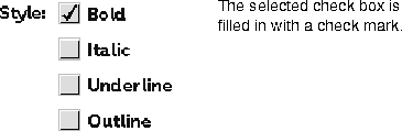
When the user mouses down to click on a check box that does not have a check mark, the check box is highlighted. On the mouse up, a check mark appears to indicate the check box is selected. The check box setting remains on until the user clicks the check box to turn it off.
When to use check boxes
Check-box layout
Check-box interaction

[Contents]
[Previous]
[Next]
 Click the icon to mail questions or corrections about this material to Taligent personnel.
Generated with WebMaker